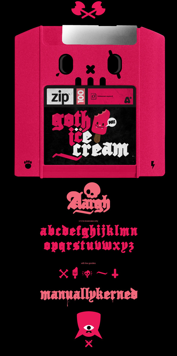
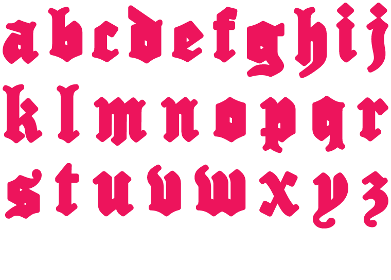
custom lettering experiment for supremebeing™ design-a-typeface competition by aargh.
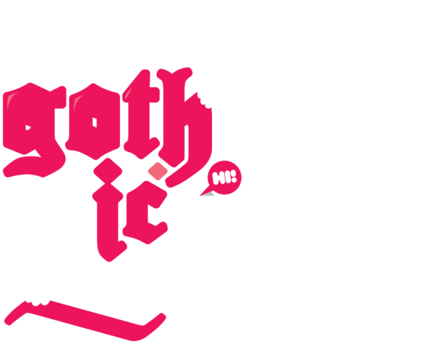
gothicecream is exploring a mash-up between esthetics of a bubble-style typeface and blackletter typeface.
gothicecream is exploring a mash-up between esthetics of a bubble-style typeface and blackletter typeface.
i like to think of the result as a ideal typeface for gothic ice cream packaging. the new born letters does not respect traditional blackletter construction rules. let’s call it pinkletter typeface.

objectives of the contest were all the characters of alphabet and composition of brand name - supremebeing.
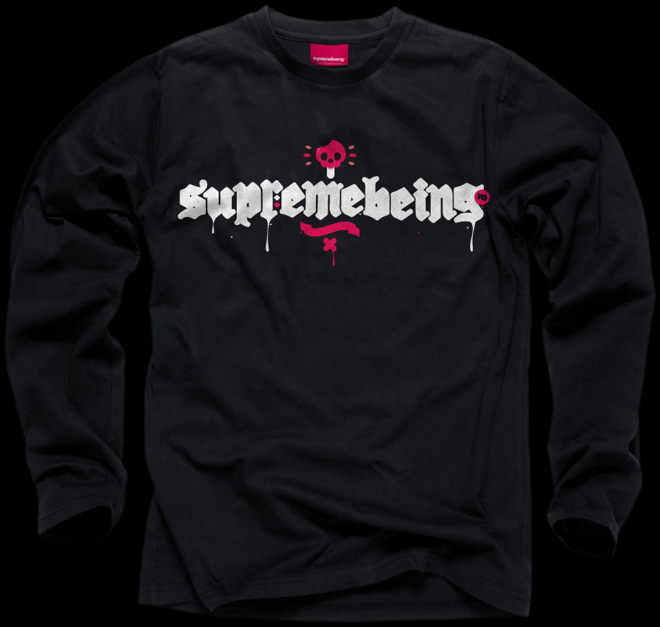
the typeface clearly does not match supremebeing's visual identity (however it was part of the briefing).
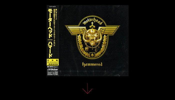
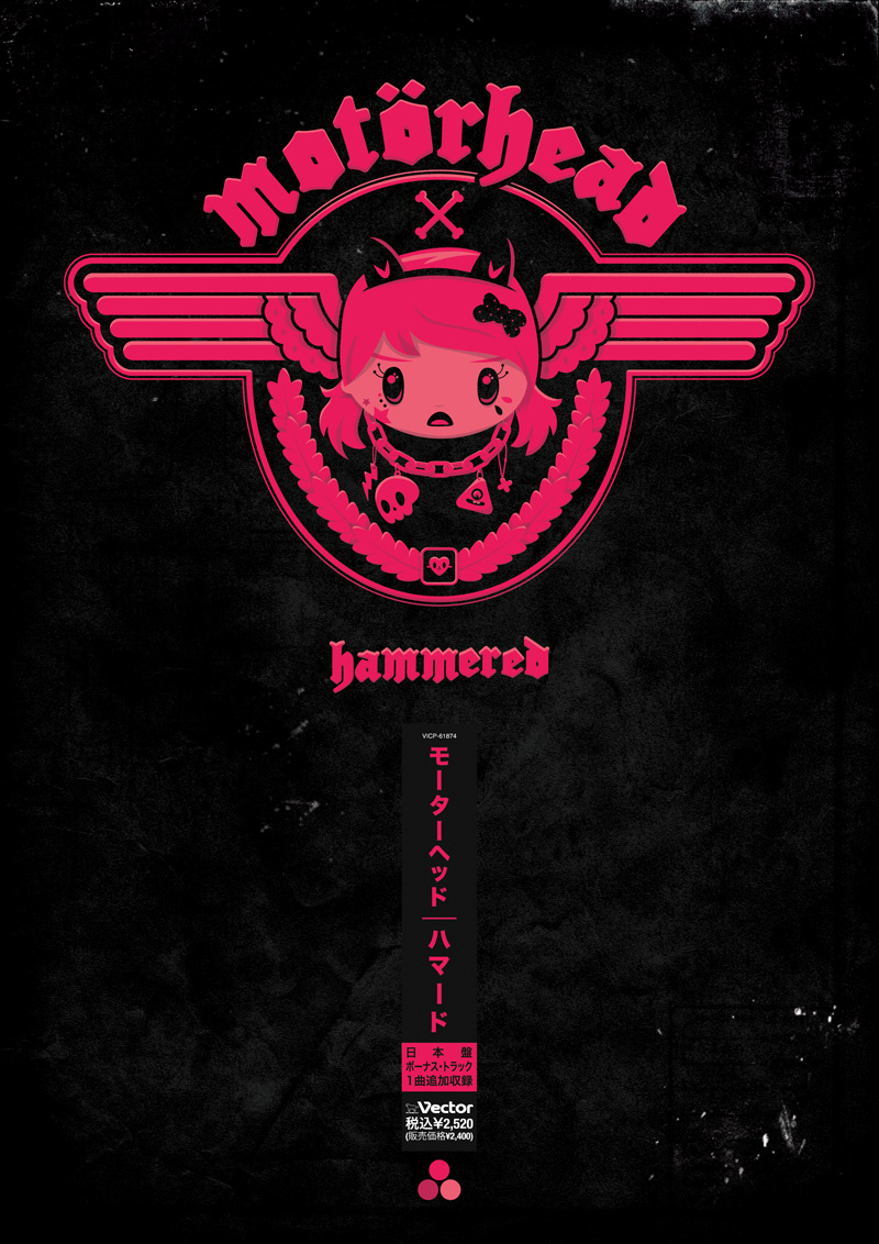
to test the letters out i created a kawaii version of motörhead's hammered cd cover including fragments of original japanese obi-stripe. the original hammered artwork done by ©Joe Petagno. think of any motörhead song in a nightcore remix while watching...
(and the poster is now available at my society6 page)